Imagine you have one thousand visitors to your church website each day. Weeks pass and you realize that there aren’t any people that visit your church. Same faces week after week. What about all those website visitors then? You start digging deeper and you realize that the average time people spend on your church website is about 5 seconds which is way more than average.
Here is a list of four reasons the texts on your church website will make people leave your website immediately.
1. It is all about us
It is so easy to tell others who we are. It is more difficult to make them realize why they should even care about it. You copywriting starts right at the header of your homepage and you want to make people feel welcome. If the goal of you church website is to make them visit you on Sunday, you need to show them how much you care about them and not how cool you are.
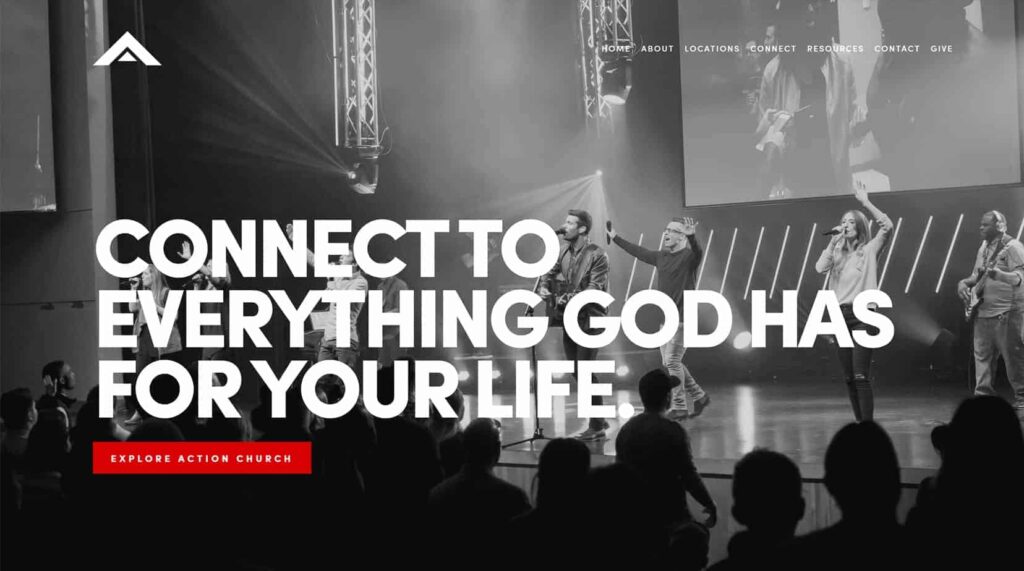
A good example of a great others-centered heading is The Action Church. They have a massive heading right in on the top of the homepage which starts telling the visitors about the plans God has for them.
2. Don’t give them a reason to read more
The first line of your paragraph will make or break the experience of your reader. Remember that if the first sentences don’t make people read more they will not read at all. Think about the way you read articles. If the beginning makes you curious, nobody needs to persuade you to keep on reading. It is the same with your church website.
People usually scan the website and so they might read the heading and a few lines of the paragraph. That’s where we need to catch their attention. Your church website is not a novel and expecting people to read everything is wishful thinking. Don’t take for granted that people will read more but give them a reason to do so.
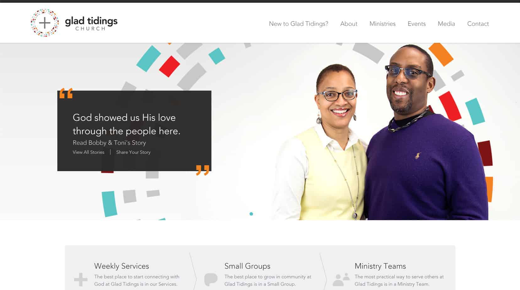
A great way to engage with the reader is to tell stories. Check out Glad Tidings Church who does it exceptionally well!
3. Talk too much
We have been working with many churches and ministries over the last years. One of the things we all have in common is that often try to use our websites to explain every single thing that we feel might require explanation.
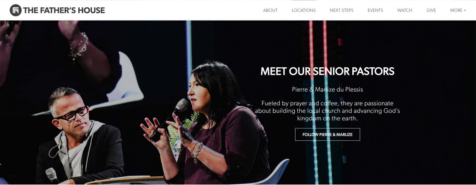
Visit The Father’s House Churches website and check how much info you can find about their lead pastors on their website. You will be surprised.
4. Never use calls to action
The last thing on the list is a clear call to action. We can’t assume that people, having read our persuasive copy will immediately feel like visiting us on Sunday. Tell them you expect them to come. Encourage them to take the next step. Try to make is strong and clear so that the visitors aren’t confused about what you want them to do.
Summary
Writing a good and persuasive copy for your church website isn’t an easy task. The points listed above are a simple checklist that can help do better. If you aren’t an experienced copywriter try to ask some people for feedback and ask them what they would expect of a great church website copy.
[mailerlite_form form_id=1]


