Sooner or later you will get to the point when you will know your church website needs a redesign. Or you are planting a church and you need your very first church website. In the process, you will probably look for inspiration online and try to see how other churches do the web.
This is why we bring you church website reviews. We discuss some of the best church websites out there and help you find inspiration. This time we check out a website which was designed not long ago. It serves the church pastored by Judah Smith and I have to be honest, I spent so much time there and learned more about the church. Let’s see how they did it.
1. The church name
This point isn’t that much about the online. It’s more of a branding thing. The name carries a meaning and this is what I absolutely love about Churchome. The name has a great story behind and we will discuss is it another post because renaming deserves more space to understand better.
2. Design quality
When I visited the site it felt so much different that I immediately started browsing. The week when I came across it I spent hours checking out different church websites and this one grabbed my attention so much. The overall design quality is outstanding and one of the best one I’ve seen in church space.
3. Use of white space
The design makes me feel learn more and explore but the layout made the content on the website so easy to digest. Most websites try to give so much information that the layout gets pretty overwhelming when everything is squeezed in so much. Not a case here.
The content on the website is really well-spaced. You will immediately feel the difference when you notice the space between the website elements such as graphics, columns, images, text, margins. The space that is left untouched on Churchome website quickly directs users attention to certain elements that are to be highlighted and the message is clear and direct.
4. Typography
All the headers and most of the textual content use Superior Title font which is a premium serif font. It plays a major role for the entire design and also gives an amazing feel of elegance. It is nicely paired with Avenir, which is a sans serif font. This great font combo proves it is really worth to spend some extra money on typography that makes the difference.
5. The colors
There aren’t many colors on the website which also a great move. In fact, there is only one color that doesn’t fit in grayscale and it is used to finish up the details on the website and in a number of hover elements. Brown is a natural color which is a great selection for a church that wants to communicate strength, reliability, warmth, comfort, and security and it fits so well with Churchome.
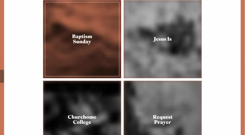
6. Lazy loading images
Some websites use it, some don’t but using lazy loading images will make your church website so much better. The main reason is that it improves the overall user experience with a faster page load. What lazy loading does is it only loads the images that the user can actually see. Imagine how it feels when you first visit a website and it never stops loading before you see anything. And once it loads you don’t even scroll down but click a menu item. This way we can waste so much time loading elements user will never see. Churchome website will start blurring out the images the moment you start seeing them.
7. SVG elements
Now that more and more users use high-resolution devices it is crucial to be able to use easily scaled vector graphics to have smooth and crisp edges on every design element. This is exactly what this church website utilizes. All the graphic elements except the images are SVG which is the direction we will all have to be taking to provide the best user experience for people who visit our church websites. You can check out our article to read more about SVG and other trends in web design.
Conclusion
Churchome built an amazing church website which can be a massive inspiration to all of us. They apply so many of the best practices in web design that everyone should at least check out their website to see how a growing church can effectively communicate online.
